Thursday, February 01, 2007

Madder now...

Jessica Gould over at the WCP scoops all the art bloggers in town and writes about the artistic and ownership of words controversy caused by the current exhibit at Bethesda's Fraser Gallery, which as most of you know, I used to co-own, and to which (since last year), I have no relationship with, and which is now solely owned, run and directed by Catriona Fraser.

Clear?

Anyway...

Photo by Doug SanfordThe controversial exhibit is part of Mini-Matic, and the article specifically discusses the work of DC area photographer Doug Sanford.

According to the article, Sanford broke up with his girlfriend because he was screwing around on her, so she then wrote him some nasty emails, and then he later made fine art photographs from some of the words in the emails.

According to Gould, "Some of the words are in larger type, inky iterations of hate. The rest are blurred—streaked with light, smudged, or shadowed."

The ex-girlfriend's name or identity is never revealed in any of the works.

“It was a pretty angry breakup,” he says.

And it’s gotten angrier.

On Jan. 12, the opening day of the exhibit, Sanford’s ex-girlfriend contacted both him and the gallery’s owner, accusing them of copyright infringement and demanding that the photographs be taken down. If they didn’t comply with her wishes, they say, she threatened to take legal action.
However...
According to Torsten Kracht, an attorney with Akin Gump Strauss Hauer Feld, although Sanford “may not be able to claim authorship rights in the underlying text of the e-mail, he may have a copyright in the unique photographic image he created because of the way he has put it together.” Kracht, who is not involved in the controversy, writes in an e-mail that Sanford “has selected only certain words, chosen to blur some of the text at the bottom and brought out the texture of the paper on which the e-mail is printed. That’s all his artistic expression and interpretation.”
Read Gould's excellent piece here.

I am not a lawyer (although it seems like everyone else in my immediate family is) and thus here's my question: I was under the impression that once you hit the send button and send an email to someone... a regular email and not an email containing the full text to your next novel... anyway - as soon as that email hits cyberspace and it's received by the intended recepient(s), then that's all she wrote and the recipient(s) can do anything they want with that email, including photographing it, posting it on a blog, printing it and stapling it to a telephone pole, etc.

So for the copyright lawyers who read this blog: Is that correct? Or does the copyright of an email always belong to the originator?

Although I think that when one writes a letter, the author always owns the copyright to the text of the letter, although the recipient of the letter has actual ownership of the letter itself, and can sell it on Ebay if he or she so desires.

Not that "email copyright" it would strictly apply to this case, as it appears to me that Sanford did not "publish" her emails, but rather took some words here and there (sort of a "visual sampling") and re-presented them in a "new" work of art that is not immediately visually recognizable as the original email.

Update: Bailey offers some advice.

Opportunity for Artists

Deadline: Unclear

Open Call for Web Based Art for the Web Biennial 2007. Submissions and exhibition Start: February 1st and end December 31 2007. The Web Biennial is a project produced by the Istanbul Contemporary Art Museum, in Turkey and artists can participate through the portal located at webbienial.org.

One project per artist. No Portfolio sites, No Commercial Projects. This project is totally free and open for all. This year all languages welcome except, in the head tags.

The Web Biennial is a NO concept, NO curator, NO location, NO sponsor event.

Send them the URL of your Web Based Art project. Put inside the head tags of your index page:

"Web Biennial 2007 - Name of the Artist - Name of Your Project." The index page and the web site needs to be on the same domain. No attachments.

You can e-mail submissions to: webbiennial@yahoo.com

Please also put in the subject line of your email: "Web Biennial 2007 - Name of the Artist - Name of Your Project."

First come first served; collaboration proposals from institutions welcome.

The Power of the Web

The other day I finally closed on my Potomac house, which I may add, sold at a helluva good deal.

Anyway, the really nice guy who bought my house informed me that he had learned all about the house and the sale, etc. by virtue of being a reader of this blog!

Wednesday, January 31, 2007

Picts at Honfleur

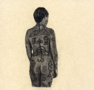
The below drawing is currently hanging at Honfleur Gallery as part of the pre-grand opening show on the art of tattooing. Call them at (202) 889-5000, x 113 to buy it.

It's a Pictish woman from my Pictish Nation series. Learn more about the Picts here.

Pictish Girl

Kirkland in New York

This is what happens when a motivated artist decides to take the artbull by the horns and organize his own first solo show in NYC.

Read JT Kirkland's NYC debut here.

Go JT!

Civilian Moves

Kriston Capps tips us that Jayme McLellan's Civilian Art Projects will move into the building (at 406 7th Street NW in Washington, DC) that currently houses Touchstone Gallery and was once home to Numark, David Adamson, eklektikos and others.

Read Capps' post here.

Tuesday, January 30, 2007

Proposal to DCCAH

I sent an idea to the D.C. Commission on the Arts and Humanities in 2004 for a novel (in my opinion anyway) public art project dealing with the now vert traditional use of video as an art form (now in its middle age).

Nothing heard back from them so far, so I am assuming that they are not interested, and I am thus hereby posting a gist of that idea/letter, with some corrections and updates, in case some other city or organizer is interested:

Summary: This point paper offers a recommendation for a recurring public art project designed to attract worldwide attention to the Washington, DC fine arts community. This idea is being submitted for consideration by DCCAH for future implementation.

Background: Washington, DC public art projects, like many other cities, have yielded a mix of public success and bitter art criticism. Most recently, projects such as “Party Animals” and “Pandamania” have enjoyed spectacular public acclaim, but have been severely criticized by area art critics. Whereas it is my belief that a publicly-funded DCCAH should answer to the public and not to elitist art critics, I believe that I have come up with a concept and idea that is both novel and creative. No other city has done this before (to my knowledge) and this project, if funded and implemented, will make a huge leap in placing Washington, DC on the leading edge of the art world.

The Project: A call for artists to create art videos. No theme, no guidance (other than the standard caveats to preclude pornography, hate-mongering, racism or personal attacks): just a call for artists (either worldwide or Greater DC area) to create an art video. This has never been done before by anyone, anywhere, as a mass call for public art. A public project that delivers art videos on a massive, public scale will place this contemporary genre of art outside of a museum environment for the first time ever.

The Logistics: 100 20-inch TVs with built-in DVD players will be needed ($269 each). Each one placed inside a custom built viewing bubbles (see attached design). The viewing bubbles can be constructed by the same company who built the Pandas. The material for the “bubble” can be the same as the Panda material, except for the viewing area, which should be constructed of Lexan, which is the plexiglass material from which NASCAR racecar windshields are made from; it is practically indestructible and it does not fog or scratch. Cost for these “bubbles” should be approximately the same as a panda or party animal.

Electrical power will be needed; however, this is easily available on nearly every street in DC, as every single lamp post in Washington has a power source at the base of the lamp post. The “bubbles” will have to be built and placed so that a safe connection to the power source can be accomplished.

The accepted videos will be run on a 24/7 continuous loop so that they can be viewed by the public ad hoc. At the end of a specified period, signed still photography from the videos can be auctioned off – or even sold throughout the period (from a website). This is very common in the world of art videos – no one buys videos, but they will buy signed photographs from the videos.

The Process: A worldwide call for videos: the call for art can be made for free in many Internet web sites (places like artdeadlines.com as well as magazines such as ArtCalendar, etc.) If successful, this can become an International Public Video Biennial (no one is doing this!) to a huge public audience. Call it the Washington Video Biennial!

We ask for artists to submit videos (CD ROMs) and then a panel selects 100 videos to be exhibited to the public. Each year DCCAH can hire two curators to select the videos (or an advisory panel can be picked to select the videos).

Next Step: I hereby request a meeting with DCCAH to verbally explain this project and answer any questions.

Signature

Monday, January 29, 2007

New gallery

A while back I discussed about a new independently owned commercial fine arts gallery that would be opening in the Tysons Corner area of Virginia.

Although construction is still going on, it looks like sometimes in February will be the grand opening of Habatat Gallery Virginia, owned and run by Lindsey and Jay Scott.

This is a "second" Habatat, as the gallery has been around since 1971 and there's another one in Florida. The galleries’ focus is on contemporary art, national and international, in a variety of materials, but certainly with a recognized focus on glass.

In fact, Habatat has already partnered with the American University Museum at The Katzen Arts Center to bring an exhibition titled "Contemporary Glass: Beauty and Innovation" at the end of this month.

This will certainly add a new "power" gallery to the Greater DC area art scene, and even more, continue to focus a lot of attention on the area as one of the "glass" hot spots.

Welcome!

Sunday, January 28, 2007

Turnbull on Campbell

Shauna Turnbull is going to start doing some emerging artist profiles once in a while. Below is her first one:

"Coffee break with Muralist Kelly Campbell"

by Shauna Turnbull, Art Addicts

Turnbull: You graduated with a degree in graphic design from Liberty University in 2006, but you've stated your true passion is painting. Tell us about the juxtaposition of graphic design, portrait painting, and murals.
Kelly Campbell
Campbell: Graphic design, portrait painting, and murals have a few things in common. Each relies on the knowledge of composition, color, value, and relaying a specific message to its viewer. Graphic design is heavily based on text to relay its message, whereas something more fine art in nature depends on subtleties such as an expression, or a color choice, to get a visual message across.

Turnbull: You currently make your career as a portrait painter and a muralist. Can you speak to the challenges and rewards of being a full-time freelance artist? How do you divide your time between making art and selling art?

Campbell: I find inspiration in everything. Dreams, everyday life, a wise phrase a friend might have said, nature, my family. There is so much life it's hard not to get inspiration. And it's not just artists that can find this "inspiration" from things; anyone can, as long as they take the time to "smell the roses"-- take the time to stop and see something beautiful, or sad, or ugly instead of just passing it by.

I love being an artist. So for me, the rewards far outweigh the challenges. Some rewards I have are that I can work at my own pace. I don't have a 9-5 job, I don't sit in rush hour traffic (Now everyone in DC wants to be an artist after hearing that), I work from home, and I have free-time.... sometimes.

Challenges are that as a freelance artist, the jobs aren't always continual. My work is very seasonal. Over Christmas I was swamped with portrait jobs-- everyone wanted that special gift for a loved one. Now that rush has died down, the jobs are coming in slower, however it's mostly mural jobs (which pay a lot more), but I have lots of down time.

That's why I have a part-time job as a Kidzart teacher as well--so I can at least have some kind of steady income. I've also picked up a job teaching painting classes (for ages 15+) at Michael's. Another challenge I have are deadlines. Sometimes people come to me a week before they need something and I always do my best to meet their needs. Right now I have three portraits due in February, and on top of that I have to fit in mural jobs. It can be difficult to manage my time. I have been so busy that I haven't really had time to make art other than the commissioned work. So for me, making art is selling art.

Turnbull: You are fairly responsible in using non-toxic and lead free paints (especially in residential homes and in children's rooms). Tell us about your favorite products and how they tie to today's environmental concerns.

Campbell: Well, lucky today being able to buy lead based paint is almost non-existent. I add those details to my ads though because many people don't know anything about paint and have genuine concerns about it. For murals and many of my paintings my medium of choice is acrylic. I like acrylic because it dries fast, cleans up with water (no turpentine) and can do a variety of techniques. My favorite brands are Liquitex Basics acrylic paint--it comes in a great squeeze tube and lasts FOREVER, some of mine I've had for over ten years and it hasn't dried out, and I also use Americana, and Craft Smart brands for murals. Below is a copy of a winning portrait that took first place in painting in a juried art show at my college.


portrait by Campbell


Turnbull: As a portrait painter and a residential muralist, how do you best bridge the gap between the patron's vision and the artist's vision for completed works?

Campbell: Well, that is a difficult question because you need to give the client what they want--but I also realize that they aren't the artist. If they were they wouldn't have hired me, so it's my job to ask the right questions and get on the same page visually as them, and to be truthful and upfront with them if I think something that they want might not fit--or wouldn't work in the total composition.

If they are set in their idea, then it's also my job to "make it work". Even if they have an exact photo of what they want I always show them a sketch of what I am going to do and make sure it is exactly what they would like. One of the worst things a client can say to me is, "you're the artist, do what you think" because 9 times out of 10 it is not at all what they think. And just because I AM the artist doesn't make everything I think great. This is why asking questions and getting into the client's head is vital.

Turnbull: What major differences do you find between residential murals and completed commercial murals?

Campbell: There are a couple differences between residential and commercial murals... none of which involve painting them. The method of painting them is pretty much the same.

With commercial murals, I get more exposure as an artist because more people see them. It's also a lot more impersonal. But when I am invited into someone's home, to paint something they are going to live with for a very long time, it makes the painting so much more personal to me and to them. It drives me to create something they don't just like, they LOVE. Something that after I'm done, they want to have a get together at their house so they can show it off to all their friends and family.

This reminds me that people view murals as somewhat of a luxury (even though mine are VERY affordable). Something I enjoy about doing residential murals is getting to know some of the family. One of my favorite memories is when I did the Scooby mural in a two-year old's room, and after I was done he came running in yelling, "Scooby! Scooby!" and tried to hug the wall.

Two examples of my commercial murals can be found at the Sacramento Veterinary Hospital in Alexandria, VA and the Explore and Moore Children's Museum in Occoquan, VA. A portion of the vet mural is below.

mural by Campbell


Turnbull: When you think of great muralists, who most inspires you? Of living artists in the DC area, who do you expect to see rapidly rise in the art world.

Campbell: Well one of the greatest muralists was of course Michelangelo with the Sistine Chapel. He did the whole thing on his back, and the quality of work was amazingly beautiful. It will bring you to tears, and I know for a fact - I got to see it this past summer. How can any muralist compete with that?

Of living artists in the area do I expect to see rapidly rise - well me of course. There are many artists out there that I am sure will “make it¨, but with art today that’s so hard to say because many times art is about the latest trend and the newest idea. And a lot of artists make paintings that are so open for interpretation for whatever the viewer wants to think about it. So who am I to say who the next big name in art is?

Some of my favorite galleries are in Old Town Alexandria. There are so many it is hard to choose one, and each offer a variety of beautiful works of art from various artists - each piece offering something unique to its viewer.

Turnbull: Do you routinely do trade shows, craft shows, fairs? Do you exhibit in boutiques or eateries? Can you speak to the marketing techniques that either work or do not work in your experience?

Campbell: I don’t do any craft shows or trades shows right now, but they are definitely a possibility in the future. One thing I really enjoy and would love to market especially in places like Saratoga, NY is horse portraits and art. I would love to be able to spend my free time painting and drawing them and doing a specific show just for that. But right now I keep busy and pretty much only have time for my commissions and my art journal.

Something I’ve found to be very important when getting jobs is to be personal with the client. Whenever I get an email asking about estimates or whatever, I don’t just send out an already typed up letter with just their name dropped in, I do my best to write each person (and it takes hours every day to write everyone back) and I’ve found that people who end up being my clients like that. When I take the time to email them or call and answer their questions ultimately it made them want to work with me, and not someone else. A technique for advertising that I’ve also tried that did not work was fliers. The most effective method I’ve found has been online advertising and word of mouth.

Turnbull: Can you tell us a little about your journey to becoming an artist (where you grew up, when you knew you wanted to "art", how it was to share that vision with family, how it's been to realize that vision, what you're looking to accomplish in 07)?

Campbell: I was born and raised in Alexandria and have been drawing since I could hold a pencil in my hand. I was lucky enough to have parents who realized that my artistic ability was well-advanced over other children and encouraged me to do art in any way they could. They bought me art supplies, enrolled me in various after-school art classes, and encouraged me to attend college for art. I consider myself so lucky to have parents that let me be what I was born to be. When I was little I always said I wanted to be an artist when I grew up and that passion and desire is still in me and I will continue working in this profession for as long as I can. I am currently in the Manassas area. I pretty much work some of MD, DC, and Northern VA. My website is at www.kellycampbellartist.com.

Turnbull: Annie Liebovitz recently explained she believes interaction with her subjects (even entering a simple dialogue) changes both the light and mood before she's even begun shooting. For your portrait work, can you share an experience you had about the transference between painter and model?

Campbell: I can draw/paint from a live model, but for my work I prefer working from photos. It is true, knowing the subject puts a whole new light to the portrait. I am doing a portrait now of a child who is in one of my art classes. He is so full of energy (it can be hard to calm him down sometimes) and I want to portray that in the portrait.

I think it’s more difficult to portray someone you know because adding their personality to the portrait gives a whole new aspect to the painting and it takes so much more planning. However, when you’re finished even someone who doesn’t know the person will be able to look at it and say, "Wow, he looks like a very spirited child."

Turnbull: Although the nation is enjoying tremendous growth in new commercial development, it is also true that many neighborhoods suffer from disrepair and neglect. When you think about murals as an art form as they exist to revitalize older or ugly buildings, where do you think mural artists need to "go."

Campbell: I always enjoy seeing collaged street murals done on the side of a brick building, providing a sense of life and a taste of what that city has to offer. With something like that, I think the artist has to decide what he wants to portray to a multitude of people in a fast amount of time. Murals like that are somewhat of a billboard for the artist. I’ve never done a mural like that so this question is difficult to answer.

Turnbull: Animal portraiture is another growing trend, with anticipated market increases in all things having to do with animals (clothes, toys, art, schools, etc.) What do you make of this current boom?

Campbell: I didn’t even know this was a growing trend. I am excited to see how it affects my work because animals are my favorite subject. I do think that there are definitely a lot more animal portrait artists out there than people portraitists so I know there would be more competition.

Turnbull: Kelly, do you participate in or know of any interesting or new art related non-profits? We are always interested in highlighting causes utilizing art to achieve goals.

Campbell: Well what comes to mind is recently I have been asked to “donate” a mural for a child’s room for a silent auction benefiting an inclusive preschool (that accepts all children, even those with disabilities) in Alexandria. The auction is for a six foot mural and one accent of their choice (normal retail value being around $600-700). The auction takes place in March.

Turnbull: Lastly, if you could be director of the National Gallery (or any other DC area museum) for one day - what immediate change(s) would you implement?

Campbell: I wish I could give an interesting and ingenious answer to this question, but I can’t think of anything that I would want changed. I’ve visited the National Gallery many times and I always enjoy it the way it is.

Friday, January 26, 2007

The Top 25 Web Celebrities

Forbes has come up with a list of "the biggest, brightest and most influential people on the Internet. From bloggers to podcasters to YouTube stars, these are the people who are creating the digital world from the bottom up."

And guess what? There's a conceptual artist on that list!

And guess what? He's from the Greater Washington, DC area!

And guess what? His last DC exhibition had lines around the corner waiting to get in!

And guess what? His road to fame started at the last Art-O-Matic!

Frank Warren, one of the nicest guys that I know, and creator of PostSecret, is number 14 on the list.

Congrats to Frank!

Here's the list:

1. Jessica Lee Rose


2. Perez Hilton


3. Markos Moulitsas Zúniga


4. Matt Drudge


5. Seth Godin


6. Jeff Jarvis


7. Glenn Reynolds


8. Amanda Congdon


9. Robert Scoble


10. Michael Arrington


11. Hosea Frank


12. Jimmy Wales


13. Harry Knowles


14. Frank Warren


15. Cory Doctorow


16. Xeni Jardin


17. Leo Laporte


18. Merlin Mann


19. John H. Hinderaker


20. Charles Johnson


21. Kevin Sites


22. Mark Lisanti


23. Jason Calacanis


24. Om Malik


25. Violet Blue
Read the whole article by David M. Ewalt here.

Caroline Altmann's Idea

Alexandria, Virginia artist Caroline Altmann writes to me:

Would love to plant an idea on expanding D.C.'s art audience.

A year and a half ago, I started sending out emails to non-artist friends who were interested in being informed on "must see" exhibits. It is a small effort on my part of a greater plan to increase awareness that D.C. has an important art scene worthy of national and international attention.

My observation is that people (including the well educated, observant, aesthetically sensitive) are afraid of art (Oh yes, artists are equally shy). Many are afraid that they don't know enough about art to be secure in their likes or dislikes. Even art buyers retain this "I am not an expert" humility. Many are unsure of what is art and therefore something that they could chose with confidence for themselves.

It is the responsibility of us in the field to make the subject seem less daunting.

One of the most important things we could do is to make art more accessible. How to do this? There are, of course, many ways. More information is a good start.

Isn't the British model wonderful of presenting works of art in context of history, culture and personal background of the artist? It demystifies the art. Nothing creates a greater barrier between the art and the viewer than the sparse labeling of art with titles and medium only.

Where do you find explanations?

In special shows.

So I created an emailing list to tell people of extraordinary shows in galleries and museums. At well-curated shows, learning is easy and enjoyable. Some of my past recommendations were "Sculpture Unbound" and Jean Pigozzi's extraordinary modern African art collection.

The response has been wonderful -- my friends appreciate the personal recommendations. And, I am respectful of their email inboxes and recommend only a few shows. I would love to eventually get all artists in the D.C. area to do the same.

Imagine several thousand artists sending out emails to interested folks who love personal recommendations on what they cannot miss. We could reach 50 - 100,000 individuals! The more people interested in art, the more local newspapers, including the Post will cover the non- museum world. In 5-10 years we would transform this town.

Must see show at the National Gallery -- Diptychs

You haven't heard about "must sees" from me for awhile since I was immersed in putting together my show for the 2nd half of last year. But I'm again going out and today saw an eye-popping, superb, international exhibit.

"Prayers and Portraits" is easy to pass up at 1st notice. (I went at the urging of a NY friend). 14th-16th devotional portraits of Dutch patrons coupled with religious images, many gory, do not usually attract crowds.

But there were plenty of folks in the rooms. Here God is in the details. The workmanship is exquisite, divine if you don't mind the pun. The history is interesting, and if you catch the Beloved tour guide at a 12:00 tour (check days) you will be enlightened. And don't be dissuaded by the images on the NG website. The wonder can only be seen up close (10 inches at times -- no pesky buzzers).

At the National Gallery of Art, West Building until Feb 4.

Photos and Lies

The Washington Post's Michael O'Sullivan has a really good marriage of two photographers' works in this review in today's WaPo.

O'Sullivan reviews "Self Possesed" (through Feb. 24 at Adamson Gallery in DC) and "Mini-Matic" (through Feb. 3 at Fraser Gallery in Bethesda, MD).

About "Self-Possesed" O'Sullivan writes:

"While the photographs are attributed to Prince, the show's publicity gives top billing to Mann, and, sure enough, in several of them she's holding the shutter release cable herself."
And he adds about "Mini-Matic"
A series of black-and-white photographs by Doug Sanford touches on a somewhat different interpretation of truth and lies in Fraser Gallery's group show "Mini-Matic." Using shots of printouts of angry e-mails sent by the artist's former girlfriend -- on whom he had cheated -- the works feature enlarged passages of text illustrating such hell-hath-no-fury passion as "I. Hate. You." and "I hope you suffer horribly" and "I know you're just concocting lies."
And so far it looks as I have at least one of these six predictions right.

Thursday, January 25, 2007

Rousseau on Mini-Matic

Dr. Claudia Rousseau, in the Gazette newspapers, reviews the "Minimatic" multi-gallery exhibition going on in various Bethesda venues.

"Although it isn’t the Artomatic we have all come to love, it is certainly a lesson in what happens when gallerists are asked to choose from such a huge menu. The best tend to rise to the top, like cream in unhomogenized milk, to the point that duplicate picks had to be sorted out, and names familiar from previous exhibits turned up again, although some with new work. On the other hand, all the work is not great; some real bloopers are on view — just enough, perhaps, to give these exhibits a feel of the real Artomatic circus."
Read her review here.

Here's an idea for the Washington Post: the WaPo already owns the Gazette newspapers, which are published weekly in various counties and cities in suburban Maryland.

Since they already own those newspapers, they probably also own the copyright and reproduction rights to any and all stories and columns published in the Gazette.

So... why not "add" some of the Gazette gallery reviews to the Sunday Arts mix once in a while and give WaPo readers a "second" voice and a "second" set of eyes on the area's art scene?

Makes sense to me.

An idea for Washington, DC

Or for any other American city that it; but it is especially appropriate for the nation's capital.

A Photographer Laureate.

Yes, yes a Photographer Laureate.

The idea, inspired by historically successful photographic projects including the Farm Security Administration's WPA photographers, the National Endowment for the Arts, and most directly by the City of Tampa's Public Art Program own Photographer Laureate Program (now seeking its 5th Laureate), would be for the DC Commission on the Arts and Humanities to create and fund the program to have each yearly Photographer Laureate create a "volume" or portfolio of their city-focused work which then would be added to the City's Public Art Collection.

The subject matter would be open but thematically focused on the city itself, and may include images of specific sites and subjects such as landmarks, landscapes, architecture, etc., or more peripheral themes such as portraits, cultural diversity, labor, industry, the arts, families, education, etc.

Over the course of time, the District's collection would accumulate (and hopefully display somewhere) a full, continously growing representation of the multiple and diverse perspectives of the various photographers' views of the District.

Tampa has a $25,000 budget for this that they give to their Photographer Laureate to deliver work over the year's period. Certainly the District could come up with a similar budget to accomplish this.

Wednesday, January 24, 2007

McLeod on the Outwin Boochever Portrait Competition

Deborah McLeod is the former Director of Exhibitions at the McLean Project for the Arts, a former Trawick Prize juror and currently resides in Baltimore, where she reviews art shows for the Baltimore City Paper. Below she writes about the Outwin Boochever Portrait Competition at the National Portrait Gallery.


I wanted to write about the National Portrait Gallery Portrait Competition for several reasons that I should reveal before taking the plunge. The first impetus had much to do with my brother in law, Rick Weaver, and his response to the show as a perfection-driven mannerist painter as well as a participating artist; the second had to do with the thoughtful, if protectively benefit-of-the-doubt exhibition catalog essay by Dave Hickey, and a subsequent bombastic review by Blake Gopnik; the third involved my own personal uncertainties on arguing this far-ranging, provocative collection of works and the hope that writing about it might gather it into a justly disposing order, at least for me.

Unlike the rest of the collection in the NPG, this show is not entirely about people but rather emphasizes portraiture itself. There is a great deal of converse and protective snobbery going on in and around the idea and its evidence, and that makes it especially interesting. In place of the more common event of bringing mutually minded authors together in a proportionately stretched envelope that doesn’t pop the glue, the NPG exhibition is like an envelope’s version of the world map busted apart and splayed. It is an idiosyncratic face off between traditionalist and iconoclast, each an acquired taste... but not by each other.

In lieu of Dave Hickey pondering how Alice Neel, Elizabeth Payton, Alex Katz, John Currin or Julian Opie portraits have faired so gracefully and exceptionally in the annals of art, let us imagine each of those artists early in their career (when we don’t know them), having one piece in this show. Would they stand out above the fray, look like Blue Chippers from the get-go, without their support machinery? I think that is the good and bad of this show – it is a fray – and fair or not it holds every artist in it individually accountable for their predicament, not just for summation through a single creation, but for boisterous interventions from their neighbors’ works.

If one Googles portraits, as I expect Hickey did in anticipation of his essay, and probably Gopnik too, it is easy to become somewhat crestfallen on the subject. This subcategory coexists with serious art as a commercial product potentially barren of any hierarchy. Even the silver-haired Portrait Societies offer a rather irregular insider vetting system.

On the other hand, turning the fame filters off, as well as allowing each participant only one work to defend their entire oeuvre as this show does, presents an opportunity to consider the modern predicament of humanity as a crowd of ones, how we transcend familiarities and inequities to intermingle in the disquieting presence and identity of other unlike individuals. The sitters in this array are essentially characteristic-studies for these portraits’ purposes, once separated from prepared, recruited places above some mantle or headboard. They are hardly the vanity patrons of the past, but despite bringing their own personal baggage to the studio, are principally the contrivance of the artist, just as it all is in Hickey’s “urban” art world.

This fluid exhibition diverts into two modes which relate to but barely coincide with Hickey’s breakdown of self, family and stranger. The two reduced to a nutshell genres are romanticism and journalism, with the latter being the most prevalent by far. Most of the artists demonstrate an aesthetic weaned on current event type shots, foreground personas posed in the aftermath of some notification, censure or honor (Jennifer Kryczka, Ginny Stanford, William Lawrance, Sharon Sprung, Armando Dominguez, and Amber Kappes incline in this direction), or candidly snapped in the midst of an event or phenomenon (Tina Myon, Bryan Drury, Jared Joslin), or looking provokingly antagonized by a recent adversity or long privation (Doug Auld’s overtly sensationalistic Shayla, Jenny Dubnau, Nathanial Lang, Catherine Prescott, Costa Vavagiakis’ poignant, palliative Arthur VI, and the epic portrait by James Seward).
Sam and the Perfect World by David LenzThere is no shortcoming in the close-up and personal stylistic approach. It is honest visual orientation that appropriately documents its period and place in this show. The subject’s location, far from being nowhere in time and space, is conventionally anticipated in an accompanying record; the “human interest” write-up. An imagined byline supplies the necessary rest in this cultural example. But there are many works of this sort that do involve journalistic backdrop compositions, even if reality is radicalized, or tampered with, such as David Lenz’s cover image, so I find it curious to read that Hickey feels the show bereft of them.

The romanticism of the portrait competition arrives in a variety of forms. But these forms are generally stitched together by the artists’ various indications of intimacy. Among this group are the most and least successful works in the show. Intimacy is a trap of sorts for the viewer. The most horrific example of romantic intimacy is Steve DeFrank’s Lite-Brite peg painting of his naked Portrait of George Guillaume by Kris Kuksi Mom and Dad aglow in acid green aura. It is retro brilliant in the way it envelopes the inauspicious subject in abject distaste. But it can’t be looked at for long, which could also mean DeFrank may one day be arranging for his Annie Leibowitz shooting. Other brands of portrait intimacy head for the more richly entwined emotions of empathy, tenderness and desire. This group does contain my personal favorites: Kris Kuksi’s utterly exquisite, fraught little Portrait of George Guillaume, the super-sized conning innuendo of Nina Levy’s hovering baby’s Large Head, the obscure, disorienting predicament that presents in Tina Newberry’s Epaulettes. The non-portrait by Nuno deCampos Magnet #3 whose stance, electrocardiograph dress, and taste in magnets and dinner options gives me much more satisfying information then Demi Raven’s useless, if au courant, absurdity, Monster v.4.

Joe and James by Brett BigbeeAbove all, for me, is Joe and James by Brett Bigbee, which rivetingly flies above several late painters without ever exacting one in particular as it presents its two boyhood protagonists. Bigbee’s characters are inscrutable in some ways and on the other hand they are vulnerable, proud, predetermined, self-protective. Skinny boy-sphinxs, formed, but still waiting to be formed. And, because I’m drawn to the living film-strip format Sara Pedigo arranges in Winter to Spring, where the home milieu takes center stage periodically as the portrait, I would add this modest delight to my list.

I am however lost to understand what about Young Marriage by Justin Hayward garnered it a Commendation from the selection committee. It is sterile and self-conscious, bordering on that silly surrealist blip in time that we apparently just cannot shake, where special effects and unlikely attributes protect everyone from emotion.

The two paintings that Hickey identified as valorous and ennobling, by David Larned and Richard Weaver, are indeed. But, I cite that Maggie Sullivan by Richard Weaverrespectfully. What I shall say about their shared eloquent sensibility is how they each uniquely express in these portrayals a quiet, mythic longing, outside of time – in the fable of the resigned young woman who desires, in introspective solitude, something perceived as unattainable, or a liberator that doesn’t know of her whereabouts. This nineteenth century romantic intimacy seems silently signified in every line, shadow, curve and attribute, as it would have been then, its full story semi-disclosed in subtle clues. The subject may languish for requiring her dream, but her dream doesn’t languish for a byline.

The Outwin Boochever Portrait Competition’s in-depth coverage presents the choice conundrum for painters of people, and viewers of painting. That people do live subjectively as subjects, not objectively as objects, their stories are not symbols but allegories, even in the flashbulb fix of the news item. The artists that take them on do so that their art may track down the unruly and unfathomable interpretation of identity. If the NPG had settled on a collection of works that favored a particular sensibility or aesthetic, it might easily have slid backwards in time to become that silver haired European salon experience that one finds in their older installations. Their competition is made much more interesting, fresh, and thoroughly American by all the contrary, discordant arguments in their rooms. One needn’t find them all agreeable. To your corners now.

Deborah McLeod


The Outwin Boochever Portrait Competition Exhibition at the National Portrait Gallery in Washington, DC runs through February 17, 2007.

The U.S./Japan Creative Artists Program

Deadline: February 1, 2007

This program offers an opportunity for contemporary and traditional artists from the U.S. to spend a 5 months residency in Japan. The focus of the program is to foster cultural understanding.

The program is open to professional creative artists in the following fields: artistic directors of dance or theater companies, choreographers, solo theater artists, media artists, designers, architects, visual artists, composers, playwrights, fiction and nonfiction writers. Open to U.S. citizens or permanent residents. Artists receive a monthly stipend for living expenses, funding for housing, and professional support services. Round-trip transportation (up to $6,000) is also provided. Application deadline: February 1, 2007. For more information, contact:

Japan-US Friendship Commission
1201 15th St., NW, Ste. 330
Washington, DC 20005

Peter Panse Trial Ends

Remember the case of Peter Panse, the upstate New York art teacher suspended over drawing classes, nudes and a ton of other allegations?

Well... The Times-Herald Recond reports that

A year, half a dozen days of testimony, and untold amounts of taxpayers' money later, Middletown High School art teacher Peter Panse gets a 15-day suspension without pay and will return to the classroom by mid-February.

School district officials sought to fire Panse, who has tenure, accusing him of bringing sex into his high school classroom and violating district policy by offering students a figures drawing class — which would include the use of nude models — off campus and for his profit.

An administrative law judge who heard testimony over the course of four sporadic months ruled Jan. 8 that Panse did violate the no-solicitation policy, but that the district failed to prove the teacher's talk of nude-model drawing rose to the level of sexual inappropriateness. In his ruling, Joel M. Douglas found that the testimony of some of the district's key witnesses was "evasive, vague and ambiguous."
Read the whole story here.

Tuesday, January 23, 2007

A Woman's Eye...

My good friend Sharon Burton from Authentic Art DC has a really good posting with loads of photos and an excerpt from Mike Giuliano's review in the Arts Section of The Columbia Flier on the opening reception for the exhibition View from a Woman's Eye at the Columbia Art Center.

Monday, January 22, 2007

Botero in DC

If my memory serves me right, Fernando Botero's career started accidentally in Washington, DC in the 1950s.

And now my good friend Jack Rasmussen, who runs the American University Museum at the Katzen is bringing Botero's most controversial work to the Katzen.

Read it all here.

WOW!

Opportunity for Artists

"Sex Issue" exhibition at Projekt30.

Announcing the second annual "Sex Issue" exhibition at Projekt30. An exhibition showcasing fine artists exploring or commenting upon issues of gender and sexuality in our society. We are accepting work ranging from the personal, to the political, to the near-pornographic. The exhibition will be publicly juried: All artwork submitted will be presented February 2-13, 2007 so visitors may help select what will be included, unlike other juried exhibitions everyone receives exposure. The final exhibition will consist of work from 30 artists. It will run from Valentines Day, February 14 to April 15th, 2007. Mailings will be distributed to over 50,000 galleries, collectors, and fellow artists. Fee: $35 for up to 10 images. Go to: this website for complete details or to www.projekt30.com to apply online.