A Formidable New Presence
When I first reported the news about a new art space to open at the former Numark Gallery space in DC, some of the emails that I received back generally said something along the lines of "about time!" After all, the award winning space (the space won its architectural designers an award for gallery design when it opened a handful of years ago) had been empty since Numark's sudden and unexpected closing a couple of years ago.
I dropped by a pop up project, which is the new art space at the former Numark space at 625-627 E St NW, in Washington, DC, and I am relieved to report that, judging from their first exhibition, and from meeting the enthusiastic and experienced owner, I am going to predict that the District is about to have a formidable new visual arts presence in its cultural tapestry.
The owner is Amy Morton, an experienced curator with a lot of background working with auction houses, art associations, and galleries in Los Angeles, CA, Boston, MA and the DC area. As many gallery owners are, she is also a collector, and is sure to bring her own collecting sensibilities to the mix. Unlike some gallery owners, Morton brings a refreshing, bright, and smiling personality which is far removed from the cool, aloof demeanor that some art dealers like to portray. And it is clear to see that her personality is also displayed in some of the subtle innovations that she is bringing to the gallery business; more on that later.
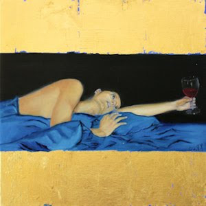
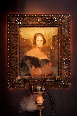
The inaugural exhibition, titled "I Dream Awake", brings together some of the artists either collected by Morton or whose work she has followed and admired over the years. The exhibition includes artwork in various media by New York artists, Mikel Glass, Kenichi Hoshine and Margaret Bowland; Los Angeles artists Vonn Sumner and Susan Burnstine; and DC area artists Rosemary Feit Covey, Laurel Hausler, Lizzie Newton and Tim Tate.  Immediately upon entering the gallery the visitor is confronted by what can best be described a sculptural painting installation by Mikel Glass. A Victorian frame, surrounded by original radio tubes and assorted seminal electric paraphernalia, hosts a painting which is a copy of Richard Rothwell's 1840 portrait of Mary Shelley.
The steam lines, antique doll's head and other assorted brass found objects, which of course include a brass Frankenstein head, gives the viewer an immediate clue about the work which is confirmed by the title: Machine in the Garden - Steampunk Shelley.
Glass explains:
A re-telling of the Frankenstein myth from a feminist perspective inspired Steampunk Shelley. In The Memoirs of Elizabeth Frankenstein, Elizabeth and Victor were raised together from childhood in order that they form an alchemic union that would allow Victor to achieve his full potential. Along the way, however, Elizabeth is beset by the strenuous limitations imposed upon her by a rigid, male-dominated society which eventually drives her into the arms of a Wicca coven.I depress the brass Frankenstein head, hold it down a second or two, and the piece, like the monster, comes alive.
In the original Frankenstein, Elizabeth had many autobiographical qualities of Shelley. In Steampunk Shelly I represent Shelley herself as Elizabeth. Her torment in the re-telling had much to do with the fact that, as in Shelley’s life, Elizabeth struggled to conceive a child. She finally succeeds, but ironically simultaneously to Victor’s scientific breakthrough – he realizes that he needs the tissue from a living baby to animate his creature. The moment depicted in the painting is intended to evoke the terrible choice that confronts Elizabeth: loyalty to the husband she worships versus personal fulfillment.
The background imagery and the frame are inspired by the Steampunk aesthetic, which is a combination of Victorian imagery with industrial technology. The frame is intended as an homage to Frankenstein and the society that he came from which, unfortunately, repressed women. The frame and all of its attributes were scavenged from various sources. For example, the valve that distributes the steam to each portal was salvaged from a defunct cow-milking machine. Frankenstein’s head was found in a scrap metal yard.
Long before I ever set brush to canvas my roots in art were germinated in the nurturing soil of found object sculpture. After moving to New York City for art school about twenty years ago, I pursued painting for logistical reasons - it took up less space. And while my heart never strayed from the abundant objects I coveted all around me in the city, I focused on trying to represent them in two dimensions. Over the years I’ve only infrequently allowed myself the indulgent transgression of pursuing expression through sculpture and performance. But Steampunk Shelley potentially represents a turning for me where I am comfortably exploring the intersection between all three. It’s a comfortable place for me, and I hope to spend a great deal of time there
Wheels turn, the gas tubes light up, and then unexpectedly, we discover individual steam portals that deliver soft plumes of steam to the painting. It is a riveting homage, and I am sure that sooner or later, someone during the exhibition will include the triumphant "It's Alive!" Frankensteinian shout that is the climax of the monster's birth.
The main gallery is dominated by the works of Margaret Bowland (whose work was a finalist for the Outwin Boochever Portrait Competition and is currently also on display at the National Portrait Gallery). The large pastel pieces show not only a remarkable technical facility made even more remarkable by the sheer scale of her works, but also an enviable mastery of a deep psychological agenda delivered by her works.

Another Thorny Crown. Margaret Bowland. Charcoal and pastel on rag paper, 60x48 inches.
The abundance of visual references makes this work a lesson in history and also a critical pitfall in trying to decipher and understand all of them. The child's gaze is hard and well beyond her years. They are old eyes and they are the key that opens up the dialogue to the other clues in the piece: the cotton crown wrapped around her head in a blunt reference to the crown of thorns worn by Jesus during His crucifixion. Cotton was the key driver for the slave trade in the American South; the white face painted on the child is an even harsher aim point at some of the racial realities and perceptions of a Black culture in a White society.
This is mostly an American painting. It is anchored deeply in American sensibilities and history, but it is also a powerful ancestral reminder of all Africans in the New World. Had this painting been done by a Caribbean artist, the child would have been crowned by a crown made up of razor-sharp sugar cane leaves, but the memories in her gaze would be the same. It is a brilliant narrative piece, and by far my favorite piece in the show.
There is also some excellent work by the several local area artists in the show. A new video piece by Tim Tate is sure to be a hit with animation buffs, and his classic "I hear the Siren's call" remains one of the sexiest videos around. Rosemary Feit Covey exhibits a terrific set of her better-known engravings, including her signature piece "Nkonde", which is almost out of print in an edition of 60.
Finally, as I mentioned earlier, Morton's open and bright personality comes through in the way in which she has presented the work. The gallery is hung minimally, without overcrowding the work, but it is in the way that information about the work is presented, that she comes through even a little more open and clearly innovative.
I have never been a fan of hiding information in art galleries (such as the whole way of using pins or tiny numbers rather than labels to identify the work). In fact I would submit that the more information that is afforded the viewer, without the viewer having to ask for it, the higher the chances that a "connection" to the work will be made.
Morton uses labels, and that's good, and lots of galleries also use labels to identify the work, the artist, the media and the price. And then she goes beyond that. In addition to the title labels, small circular labels also inform us a little more about the artist. Information such as "This artist is currently on exhibition at the National Portrait Gallery" or "This artist is in the collection of such and such museum."
There's more. Slim floor displays hold cards that add more information about a particular piece. They are clearly a derivative of the well-known museum "wall text" information, but cleverly accommodated to gallery size and space. I think that this is a superb idea and that it will have payoffs for the gallery.
The formal grand opening reception (with the artists in attendance) will be held tomorrow, Friday, March 26th from 6 - 9pm. Don't miss it - it will mark the debut of an important new art presence in our region.
See ya there!

